Friday, December 14, 2012

|poster post|

How does this poster rank on the EW list? (photo)

Hot on the heels of the latest James Bond poster, I happened upon this Entertainment Weekly article counting down the top 25 movie posters of the year. My favorites from their list include those for The Bourne Legacy, Django Unchained, The Paperboy, and Wreck-It Ralph.

Monday, November 19, 2012

|falling for skyfall|

An awesome film calls for an awesome movie poster. (photo)

I saw Skyfall, the new James Bond film, on opening weekend—a very rare occurrence for me—with my dad and friend and completely loved it. But besides the movie, I also really dig this particular poster.  Always drawn to minimalistic design, I love how this one kind of bucks tradition by drawing your eye to the bottom and then up. The classy folks behind 007 succeed yet again at leaving my designer's eye stirred, not shaken.

Friday, November 16, 2012

|10,000|

...to thank you. (photo)

10,000+ views! Thank you all for reading and making this milestone possible.

Wednesday, October 31, 2012

|bottled up|

It's hip to be square. (photo)

When someone is asked about design, I bet their mind jumps to print or web, or maybe even fashion design. But we are also surrounded by product design. I enjoyed reading about this water bottle design and some of the thought processes behind it. And I'd love to try one out considering how difficult it is to wash my current one...

Thursday, September 20, 2012

|skinny fit|

I guess he won't be throwing many huge dinner parties. (photo)
I just stumbled upon this article about a different kind of design: architecture. Construction has begun on the world's skinniest house, a home in Poland only 47 inches wide! I can't even imagine designing a house, much less one this compact considering mistakes couldn't be quickly fixed by pressing Command-Z!

Tuesday, August 28, 2012

|the nightmare before pokémon|

Besides the rad illustrations, I dig the lettering too. (photo)
Most people either love or hate Tim Burton movies. I'm part of the former camp, my favorite of his films likely being Big Fish. And I actually still haven't seen The Nightmare Before Christmas (I know, a pox upon me). While I'm not a huge Pokemon fan, I do enjoy studying the vast array of creatures, and these Burton-esque illustrations by artist Vaughn Pinpin are ridiculously spot-on stylistically. I hope there are more to come!

Thursday, July 26, 2012

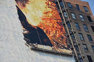
|the huge painting rises|

Go big or go home, right? (photo)
In college I often struggled with painting in my art courses, especially watercolor. As a perfectionist, it's difficult for me to let go of that and start brushing anxiety-free. Sometimes you can salvage mistakes, but it's a far cry from a quick Command-Z on my Mac. When I saw this article about painters who replicate movie posters on the side of a huge building, I gasped at the sheer magnitude of the work. While the scale does allow for a certain degree of blemishes since viewers will be very far away from it, I can't imagine working on such small portions of the painting at a time without being able to see the whole thing. Quite remarkable.

Monday, June 25, 2012

|desk-it|

I love Post-it notes, but I frequently use many at once and start to lose track of them. But what about a desk whose top is an entire Post-it?! Click here for the full article from DesignTAXI.

Friday, May 18, 2012

|how refreshing|

A Brazilian ad agency developed this genius—and literal—demonstration of how "refreshing" Sprite can be. Click here for the full article from DesignTAXI!

Monday, April 9, 2012

|photoshop fail|

One way to remove a blemish is to lose the whole thing. Check out this Photoshop failure from the pages of Vogue. I suppose it could have been worse, like flopping a photo with text or changing a model's ethnicity (yes, those have both been done).

Thursday, March 22, 2012

|getting burned|

A brand-new DVD designed to look like... a burned DVD? Check out this very clever—and appropriate—idea for the American Girl with the Dragon Tattoo film release. It will likely cause some confusion, but I think it's worth the risk.

Friday, March 9, 2012

|comic sans criminals|

Do you know someone who uses Comic Sans or is exposed to its dangerous effects? There's help. Click here to get help before it's too late...

Thursday, February 9, 2012

|put a word on it|

Check out these awesome, wordy pillows compiled by Grains of Earth! Also, this blog post title was inspired by the hilarious Portlandia:

Wednesday, February 1, 2012

|typo-phobia|

I. Want. This. Basically, Tyler Oakley gets me.

Tuesday, January 31, 2012

|logo by committee|

Unfortunately, this is what can happen when the designer's work and ideas are trumped by the powers that be. *facepalm*

Monday, January 30, 2012

|a new direction| + |honest logos|

My apologies, faithful readers. I know I've been neglecting this blog. So I'm going to try something different. I want to expand The Font Snob Blog into a place for general design inspiration, not just font-related examples (but, of course, keeping excellent typography in mind). Sound good? Here we go.

Check out these "honest" logo redesigns! (I can certainly attest to the Facebook logo pictured above.)

Sunday, January 1, 2012

|hello, 2012|

May your new year be filled with the best design, like this gorgeous lettering from this blog. It is a goal of mine—as always—to post here more frequently. Stay tuned...

--J. Gibb