Saturday, March 28, 2009

|look ma, it's upside-down!|

Usually one to follow trends way after they're trends, I read Dan Brown's Da Vinci Code after it first became a big deal. A few weeks ago, my roommate Mark was obsessively reading Angels and Demons, Brown's first book featuring character Robert Langdon. When Mark went home for spring break and I decided to stay in the dorm, I eventually picked up the book and started reading since Mark had quickly finished it.

I'm almost halfway through the book, which has already featured two ambigrams. Ambigrams are graphical figures that spell out one or more words in the way presented and in another direction or orientation. A little researched revealed that John Langdon claims to have invented the ambigram along with Scott Kim in the 1970s. Ambigrams became much more popular after Angels and Demons, and Brown has acknowledged that the last name of his character is a nod to John Langdon, who actually designed the ambigram that was used on the book cover.

The image above is a design I found online, and I included a rotated image on the right for your convenience. The words "drink guide" look exactly the same as is or upside-down, while the three heads become three new heads when flipped 180 degrees.

I once tried to turn my name into an ambigram, with mixed success. Perhaps I shall soon try again and share my results...

-J. Gibb

P.S. Since this blog's inception, I've posted a new addition each day. This was due to excitement and wanting to have lots of content waiting for potential new "followers." It will probably be a little over a week until my next post, as I will be gone to the Adventist Intercollegiate Association annual convention at Columbia Union College from Monday through Sunday. Until then, faithful readers!

Friday, March 27, 2009

|font lesson #1: serif vs. sans serif|

By definition, a font is the complete character set of a given typeface style and size: all capitals (ABC), lower case (abc), numbers (123), and punctuation (.!%). Additionally, typography is the art and technique of designing, arranging, and modifying type. Most typographers use the terms font and typeface interchangeably, as do I.

Once defining what a font is, the next level of broad classification is serif or sans serif. Serifs are semi-structural extensions at the end of some letter and symbol strokes. The term sans is French for "without"; thus, sans serif fonts lack these extensions. See two examples below:

{This type is Times, a serif font.}
{This type is Trebuchet, a sans serif font.}

Surprisingly, serif fonts tend to be more readable than sans serif at small sizes (about 12 pt and smaller), so the majority of books, magazines, newspapers, and other lengthy documents are printed with seriffed typefaces. Also, serif fonts typically have a more formal look.

On the other hand, sans serif fonts are the preferred choice for Web pages because they are more legible than serif fonts due to the resolution of average computer screens. Sans serif fonts usually look more casual than serif typefaces and are widely used for small amounts of type, such as headlines and headings.

Just as the English language has its endless exceptions, the font world has Optima. Though probably more likely to be classified as sans serif, its delicate variation of stroke width mimics the effect of a serif font, so Optima can be doubly classified.

We have officially dipped our toe into the world of typography. Hang on for the rest of the ride.

-J. Gibb

Thursday, March 26, 2009

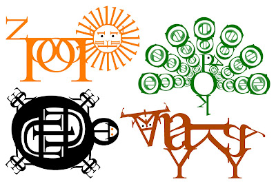
|a trip to the zoo|

Wanna see something designed by a person with way too much time on their hands? Bembo's Zoo consists of animals animated and assembled out of letters, one for every letter of the alphabet (though 'x' is a bit of a stretch). What a creative way to explore the font Bembo!

-J. Gibb

P.S. :-O>>> Thanks, Amanda Clark, for introducing me to this site!

Wednesday, March 25, 2009

|it's an ugly, ugly, ugly, ugly world|

It can be an ugly {design} world, but you can make a difference using these awesome red flag correction labels from the Design Police!


Don't be bashful... feel free to stick these anywhere necessary. The Design Police Web site states that they "do not condone vandalism or criminal damage." But if you see Comic Sans somewhere... well, you know what to do.

-J. Gibb

P.S. :-O>>> Thanks be to Mitch Allen, my one—and so far, only—follower for this find.

Tuesday, March 24, 2009

|first words and ironic circumstances|

Welcome to |confessions of a font snob|! Until now, I have only blogged on MySpace. Fortunately for me, the latest assignment in my Web Design class necessitated the birth of an online blog (ultimately for inclusion on my Web site-in-progress). I am thrilled for this excuse to begin and maintain my very own blog site.

At first, I wasn't sure what specific topic to blog about. Then I realized... as a graphic design student, one specific area of design emerged as my passion: typography. After taking a Typography class I saw fonts in a whole new way, learning the names of letter parts, studying type designers, and memorizing common typefaces well enough to recognize a font by a single letter. This semi-obsessiveness led me to label typefaces I encounter daily as terrific, typical, or tragic.

Using this blog, I will dissect fonts by posting designs I stumble upon with good/poor use of typography. Or typefaces that are simply way overused or way ugly. You'll soon develop a designer's eye and spot the rotten fonts. Together, we can rid the world of hideous type. You + font snob = scrumtrulescence.

-J. Gibb

P.S. You know what's ironic? I went to customize the layout and appearance of this blog, and what did I discover? There are a whopping five fonts from which to choose. It's an unfair world. But I settled on Georgia. ;-D

P.P.S. :-O>>> That's me giving a shout-out to BFF Kelly Zumwalt for sharing the Periodic Table of Typefaces.